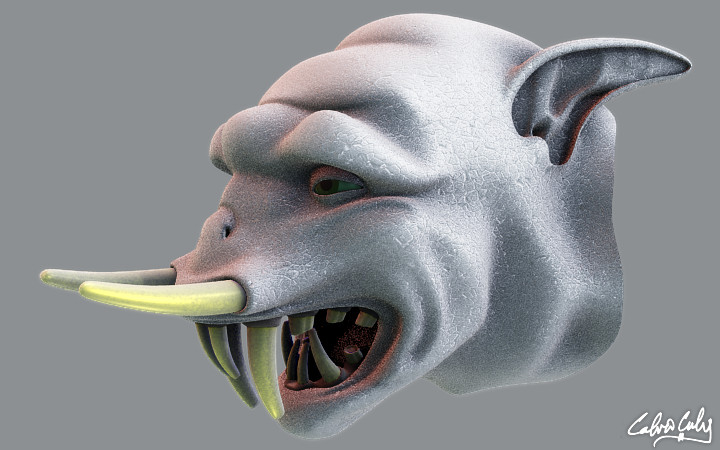
Portfolio – 2008
Process
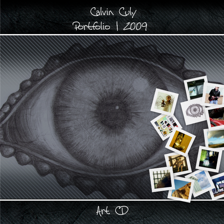
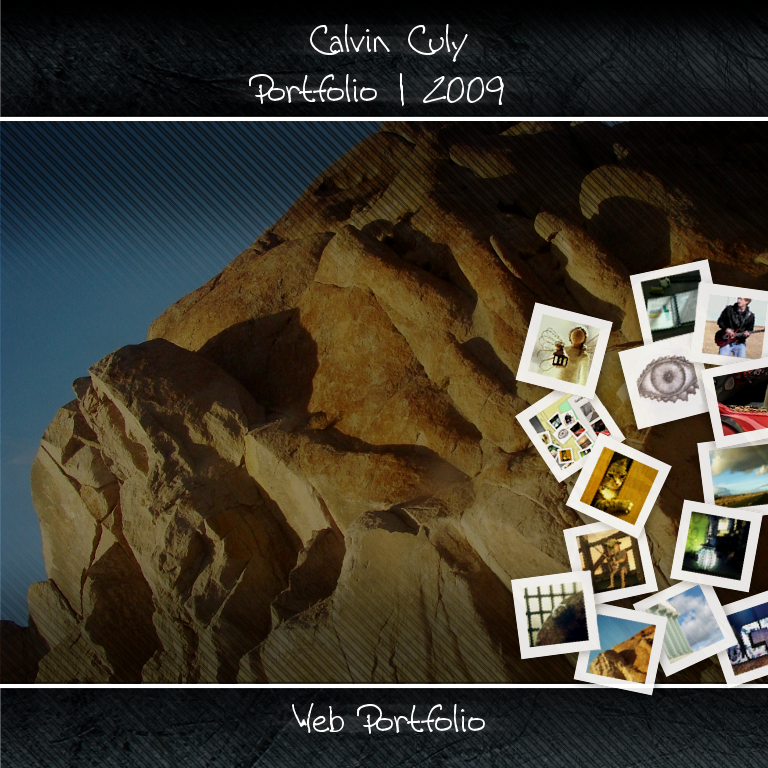
This html portfolio went through a lot of design changes before I was satisfied. I planned the basic design before beginning. I wanted it to capture the feeling of a traditional portfolio (hence the folder) while still having a modern and artistic look. I really enjoy presenting information in a new way that is less structured and more creative. I had a lot of fun with the thumbnail ‘photo’ links to the left. I tried to make it look like someone had opened the portfolio folder and they had been tossed to the side. I also used the transparency of images a lot in the design. You can see the effect of this better as you resize the browser window.
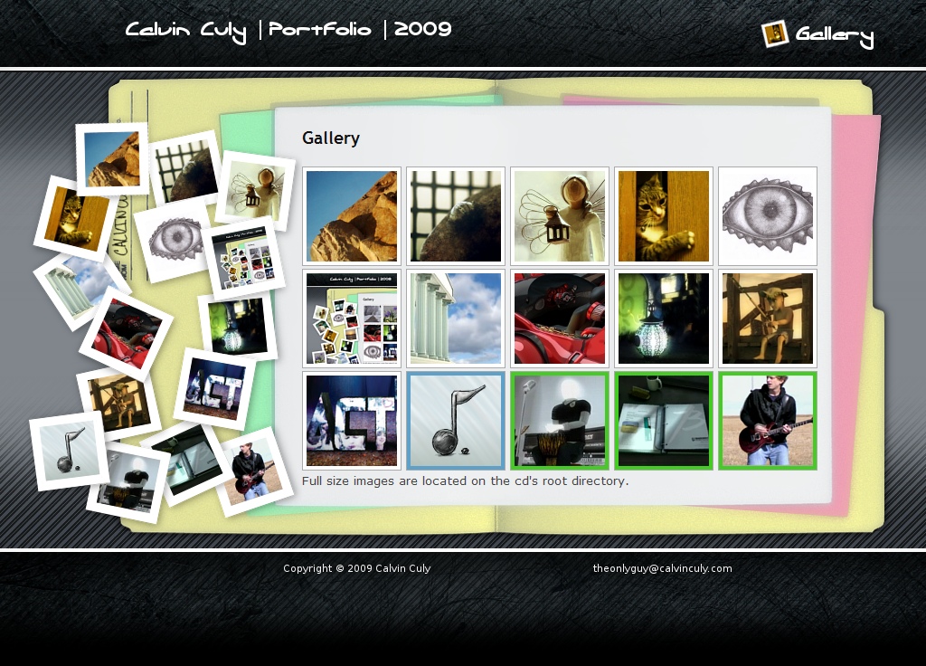
Thoughts
This project took a lot of planning and tweaking as I worked both with the artwork side of it and the code. I worked until I had both working seamlessly together in a way that allows for ease of use and creative presentation. Thanks to Lokesh Dhakar for the Lightbox script which is the one part of this html portfolio that I didn’t create myself.
Edit: I added two of the cd covers that I made when I burned the portfolio to disc.
